August 6, 2020
After so many years of false starts, dramatic reversals, and frustrating disappointments, so-called Goldbugs and Silverbugs such as myself are now finally being rewarded for their saint-like patience, thanks to the Fed and global central banks.

I am still anticipating a decent pullback, but now from much higher than anticipated levels. My expectation was that we would get the pullback first and then explode higher, but the market had a different agenda. The metals and miners exploded higher in a matter of weeks before (instead of after) the forecast reversal. But I still expect such a reversal to play out, to set us up for the final rally well into 2021 before the next big drop occurs. So there will be plenty of opportunities to buy the dip in the future.
That said, as I stated repeatedly in July, wait for a break of support for a confirmation that the pullback has begun. Back then it was 1750 Gold. We never went below that and instead skyrocketed higher. Today I will provide the levels to watch as a signal that the short-term direction has turned down. These are of course subject to change if the market continues higher. Until we break support, the trend remains our friend and the trend is clearly up.
However, there are some warning signs that we should be mindful of that this rally may be running out of steam very soon. The primary one being that we are now at overbought levels exceeding the 2011 peak records. While we know that price has already surpassed the peak in 2011, indicators such as the RSI and MACDs are now also above those 2011 record levels. It was those extremities that signaled the ensuing 50% drop. With this in mind, it is worthwhile to compare the two periods in order to gauge where we are. For this purpose, I’ll focus on Gold, although it obviously also applies to Silver and the miners.
2011 Daily Chart
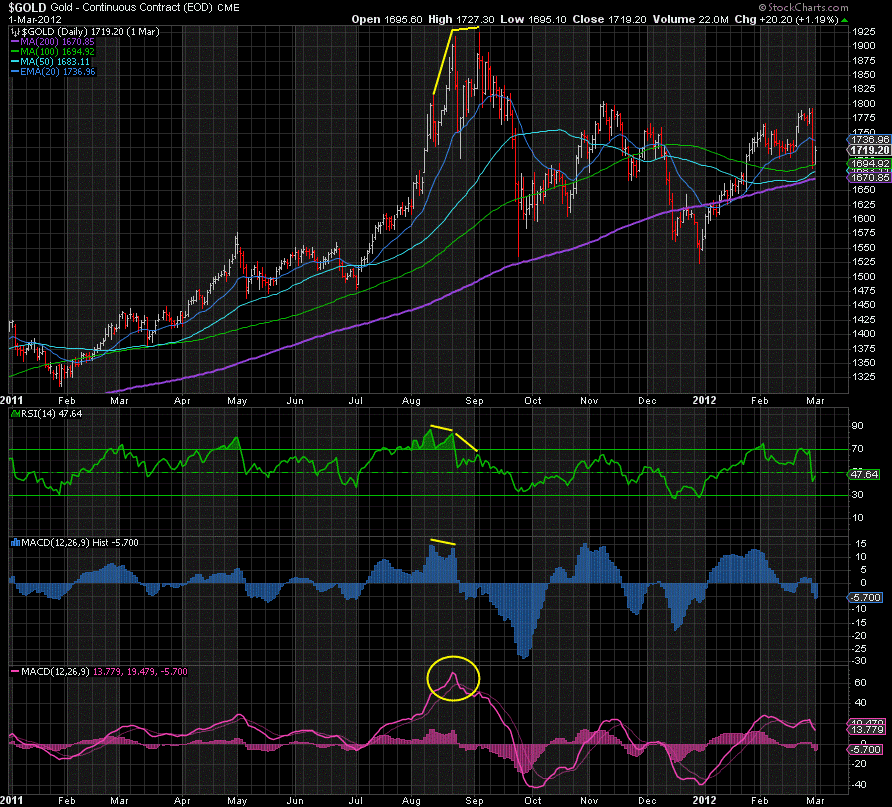
Starting with the RSI, Gold reached an over-extended peak of 88 in August 2011, the highest in decades, perhaps ever. It was then followed by two negatively divergent higher highs in price before gravity took over.
The MACD Histogram reached the second highest level on record that month, only surpassed by the peak in March 2008 before Gold dumped that year. But it was the negatively divergent peak in price that followed that signaled the downside had begun.
Perhaps most importantly, the MACD Line hit 71, its highest level on record before Gold dumped.
Current Daily Chart
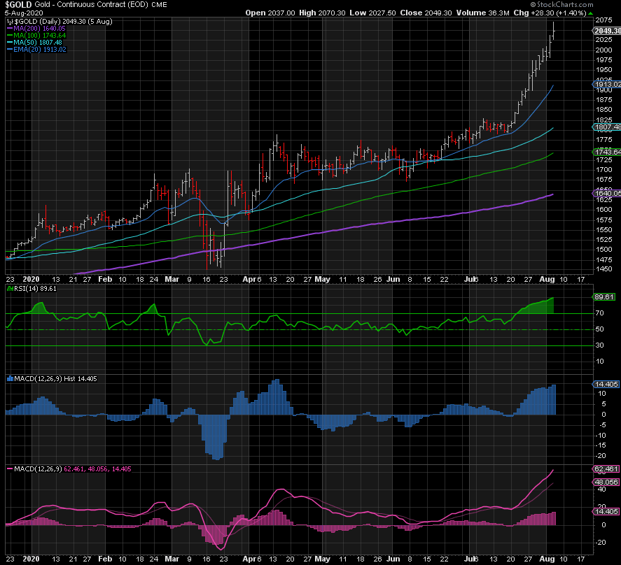
The daily RSI is now ~90 and has surpassed the record of 88 in 2011. This validates the expectation of a short-term pullback. However, if history is repeating itself, we should see at least one if not two more negatively divergent higher highs before a bigger drop occurs.
The MACD Histogram is ~15, similar to the peak in 2011, and negatively divergent to its peak in April. But again, we may need at least one more negatively divergent higher high before we head down, just as in 2011.
The MACD Line is at 62 and climbing, not far away from the record high of 71 in 2011. A big gap has opened up to its signal line, which could also suggest a pullback before a higher high matching or exceeding the 2011 peak.
In summary, if 2011 is anything to go by, then the majority of gains have been made to this point and the risk-reward is tilting to the downside, but not before at least one more negatively divergent higher high, perhaps two.
2011 Weekly Chart
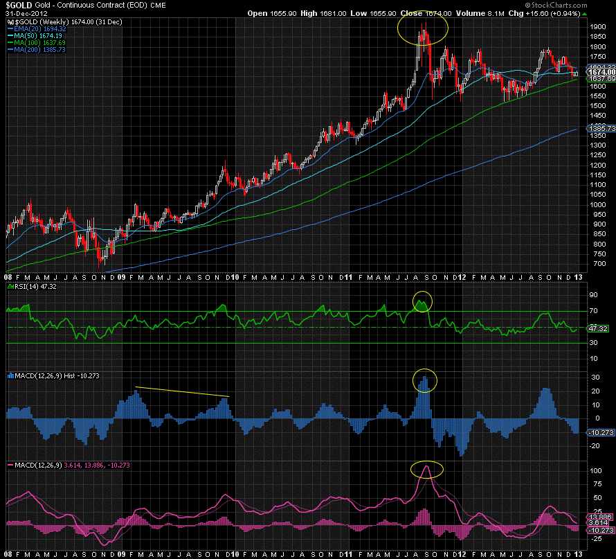
The peak in price was signaled on the weekly chart by record high levels of 84, 32, and 110 on the RSI, MACD Histogram, and MACD Line. It’s notable too that the MACD Line’s break of its signal to the downside in September confirmed that a long-term top was in place.
Current Weekly Chart
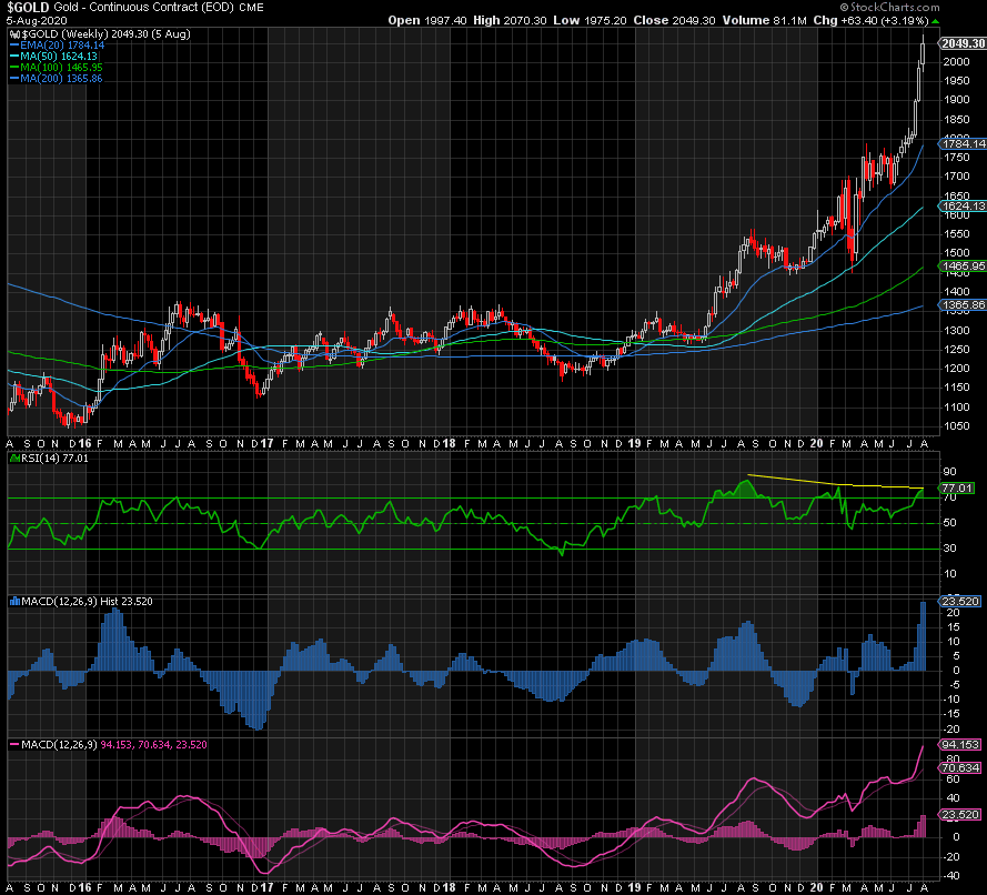
The weekly RSI matched the 2011 peak of 84 in August 2019 and has already had two negatively divergent higher highs already. Either it breaks 84 to set a new record or we get another negative divergence before we go lower.
The MACD Histogram and MACD Line are at 24 and 94 and so have room to go higher before reaching their 2011 levels, which could also signal higher highs ahead. Obviously, they’re both extreme overbought already but could become even more so.
Monthly Chart
Saving the best until last: on the monthly chart, the RSI is now at the same record highs we saw in 2008 and 2006 that led to drops of 35% and 25% respectively. However, this does not mean it is the end of the bull market if we do get a meaningful drop. As we can see in the chart, it wasn’t until we saw a negatively divergent higher high in 2011 that price finally began its multi-year drop of 50%.
The MACD Histogram has blown through the previous record highs and then some, which could signal a major peak or is setting us up for a negatively divergent higher high to follow.
The MACD Line is fast approaching the peak level in 2011, but it was the break back below its signal that followed in February of 2012 that confirmed that a major top has been reached. We should at least wait for such an outcome to be confident that the peak is in for the time being.
Sentiment & Positioning
No need to mention sentiment, which was obviously beyond euphoric in 2011 as well as now.
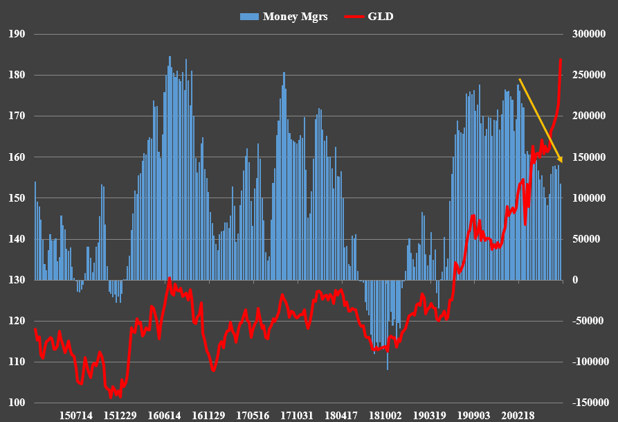
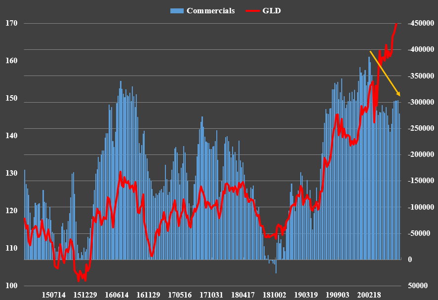
Finally, the net long and net short positioning respectively of the Money Managers (or “Funds”) and the Commercials reached record levels a month before the peak in 2011, also signaling negative divergence before price peaked and fell.
We’re seeing the same now. Neither are chasing the price higher. Then again, that could be due to a pending breakdown in the COMEX futures, similar to what occurred in Palladium.
This Time IS Different
The major caveat to the 2011 scenario is that this time is different, and loathe as I am to say it, it may be true. A crash in the dollar that leads to the end of the greenback’s role as the global reserve currency would be a seminal event and certainly outweigh any concerns about technicals, sentiment, and positioning. The asymmetric risk to the downside in real yields if nominal yields remain capped is another game changer. While this time may be different, I am not sure we’re there yet. Indeed, the dollar is overdue at least a healthy bounce before heading lower again. The “This Time IS Different” argument makes more sense medium and long-term, meaning a reversal following extremes not seen since 2011 is still possible, even probable.
Conclusion
At the risk of avoiding confusion, allow me to make this crystal clear: While anything is possible in the markets, as we have just seen, I am not expecting a drop anywhere comparable to that which occurred post the 2011 peak, but a 10-15% pullback before we head up to higher highs in 2021 is likely. For this drop to occur, key support levels must be broken first. In the meantime, we could have one or two more negatively divergent higher highs before the correction begins. Should that occur, the support levels to watch will likely rise too.
The first support level to watch in Gold right now is 2000, but the far more important one is the 1880-1900 area. Below there opens up a move back down to 1750 or 1670. Once again, I don’t recommend anyone short a bull market, but for those waiting to buy the dip, these are the levels I’m watching as a springboard for even higher highs in 2021. But until or unless support breaks, the trend of higher highs and higher lows remains your friend.
Don’t miss a golden opportunity.
Now that you’ve gained a deeper understanding about gold, it’s time to browse our selection of gold bars, coins, or exclusive Sprott Gold wafers.
About Sprott Money
Specializing in the sale of bullion, bullion storage and precious metals registered investments, there’s a reason Sprott Money is called “The Most Trusted Name in Precious Metals”.
Since 2008, our customers have trusted us to provide guidance, education, and superior customer service as we help build their holdings in precious metals—no matter the size of the portfolio. Chairman, Eric Sprott, and President, Larisa Sprott, are proud to head up one of the most well-known and reputable precious metal firms in North America. Learn more about Sprott Money.
Learn More
You Might Also Like:











Looks like there are no comments yet.